Not Your Father’s
The Pabst marketing manager reached out to Hype in early 2018 looking to partner with a creative agency that could reimagine their Not Your Father’s (NYF) product line – a flavored malt beverage that launched nationally to great success in 2015. We met with the Pabst team to discuss their needs, which are rooted in the realignment of more than 20 brands within their portfolio. In that portfolio is Small Town Brewery, the producer of NYF. We were tasked with not only rebranding the product visually, but to re-establish its brand voice and overall messaging.Scope
Branding
Brand Foundation
Packaging
Public Relations
Photography
Content Creation
Campaign Direction


Research & Acculturation
After extensive market research, Pabst found that women ages 21-35 were buying 60% of the flavored malt beverage business, which required the brand make a major pivot in every aspect. The Hype team kicked off with a deep dive into the entire NYF brand, taking note of inconsistencies in visual style, and voice and tone, current communication methods, and the differences between the original and newly established target demographic.
We noted that the original NYF brand skewed masculine and more mature, and also suffered from a lack of brand delineation – juggling names like Small Town Brewery, Not Your Father’s, and Not Your Mom’s – all of which are connected to the diverse Pabst portfolio.

Brand Foundation
To clearly define what NYF would become, we developed a comprehensive messaging guide outlining the brand story, where the brand fits into the flavored malt beverage market, user personas that illustrated their target audiences at different ages and stages of life, as well as the brand’s purpose, promise, values and personality. This document would be referenced throughout the entire rebrand process, ensuring we stay in-line with the new goals and audience.

Visual Identity
Once we had the written direction of the brand solidified, we started narrowing down visual direction, working with different color combinations and varying levels of simplicity. A mood board was delivered to Pabst, highlighting their top priorities and main desires for the brand. This included a fresh, vibrant color palette, consistent structure across their flavor portfolio, and design geared towards a more feminine audience.
Following the mood board, we hit the ground running with concept ideation. We worked first to revitalize the logotype and pair it perfectly with an ownable brand mark. This initially meant updating the brand’s “gentleman” character, but after further discussion with the client, we decided to go in an entirely new direction, focusing solely on the logotype as the brand’s primary lock-up. This would resonate more with the new demographic, and draw a line in the sand between the past and the present NYF.


The resulting logotype is a combination of bold sans-serif with rounded edges and a custom monoline script with strategically placed separations. To make the brand more flexible, we created a shortened “NYF” mark derived from the sans serif type. This short-mark allows the brand to live beyond its lengthy name and exist in a more confined space in both vertical and horizontal applications.


Packaging
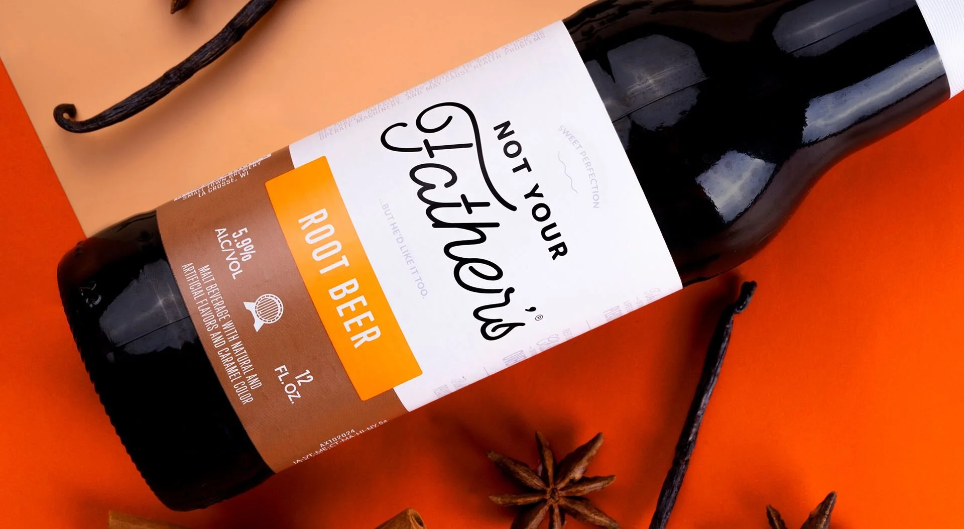
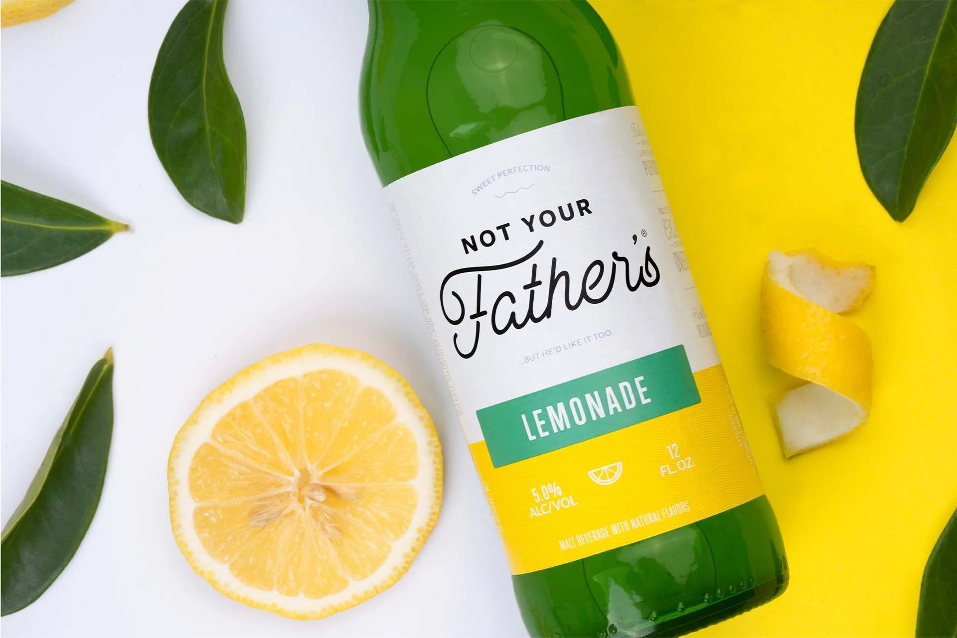
Once the brand was finalized, the product packaging needed to be revamped. While Pabst had future plans to build out an extensive array of flavors, we were tasked with packaging the original flavor, Root Beer, along with the newest addition, Lemonade.
We simplified the label design by infusing it with significant white space, allowing the logotype to take center stage and be the dominant brand element across all SKUs. We split the label into thirds, locking down the primary flavor color to the bottom third of the label and overlaying a secondary color block to house the flavor name. A texture was also applied to create more dimension throughout the packaging, and is also a consistent piece of the overall brand – found on the bottle label itself, on the website, and on social media graphics. Custom icons were also designed to further delineate each flavor in the NYF suite, plus creative copy across the labels to demonstrate the personality of the brand.
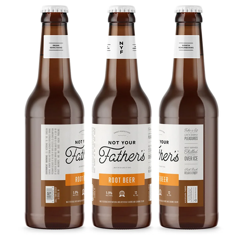


The resulting packaging is minimal, vibrant, and modernized. It was applied to all size options, including 12 oz bottles, 6-packs, and 24-packs.


Launch Campaign
Following completion of the rebrand, we were entrusted to launch the redefined NYF to the world. Within this campaign were 9 “teaser” images, a branded social media campaign, and a press release to be disseminated to trade media. After numerous brainstorming and strategy sessions, our creative team landed on the concept of “Sweet Wins” for the branded social media campaign portion.

“Be on the lookout for the new Not Your Father’s, hitting shelves 2.4.19.”


“It’s summer in a 6-pack. #NotYourFathers”


“New look AND new flavor dropping soon. Are you as excited as we are? Sound off below. #NotYourFathers”


#SweetWins
You made your bed today? Well, we salute you. You actually made that 8 a.m. yoga class? You go, Glenn CoCo. Whatever your everyday hustle is, we think life is a bit sweeter when you acknowledge the small victories. After all, 2019 is the year of #SelfCare, or whatever you want to call it. Not Your Father’s says “cheers”’ to those that not only appreciate the little wins, but know when to take a step back from the day-to-day and celebrate them. Because where you are in life right now is OK. In fact, it’s perfect. So let’s toast to the victories that others let pass them by.


We executed this conceptually with relevant and topical pop-culture references in the form of GIFs and videos, plus lifestyle photography aimed at illustrating the uplifting aspect of the campaign. The content themes aligned very specifically with the demographic’s behaviors and interests, ultimately promoting user-generated content and engagement with the brand. Ultimately, we delivered 14 pieces of content, including a mix of video, photography, and GIFs.
Public Relations
The press release announcing the rebrand was distributed to national trade publications, and focused on the aesthetic shift, as well as the target market shift and what that would mean for NYF going forward. The news was picked up in key publications, such as BrewBound and Craft Brewing Business.
Our successful partnership with Pabst Brewing on the rebrand of Not Your Father’s has also led to additional projects with their team. As Pabst continues to grow and adapt their diverse portfolio of beverages, we look forward to the opportunity to come alongside them again.
