The Joinery
The latest and greatest food hall to adorn a city rising in popularity, The Joinery in Lakeland, FL is the brain-child of Jon and Sarah Bucklew. As long-time residents and esteemed members of the Lakeland community, the Bucklew's selected Hype as their creative partner to help turn their dream of opening a food hall into a beautiful reality.Scope
Naming
Brand Foundation
Branding

Naming
From the first kickoff meeting with the Bucklew’s, it was incredibly evident to our team the amount of ambition, determination, and creativity that Jon and Sarah had poured into their business plan. Both had worked tirelessly in their respective fields — Jon with his own custom furniture business, and Sarah working hard in the corporate marketing world. But both had dreamed for years of bringing a beautiful communal food concept to their hometown of Lakeland. Both had an amazing shared vision for the concept, but they were in dire need of some help on the creative front — and that all started with a name.

Our creative team went down many avenues to try to perfectly capture both the spirit of the owners, while also depicting what the space would represent for the community. Above all, Jon and Sarah wanted to create a place that people could come together over food and drink, taking part in shared experiences that would make lasting memories. With that in mind, we arrived at the name “The Joinery”, perfectly depicting the mission of the food hall to forge relationships amongst its 9 vendors and its many future guests.

Brand Foundation
With the initial story already taking shape through our naming exploration, our creative team got to work on The Joinery’s Brand Foundation. This messaging deck would tell the story of what the food hall hope to accomplish as a business and depict the values it would hold dear: those of togetherness, joy, gratefulness, and unity. Our focus was to capture through our messaging that The Joinery was a space to visit over and over, giving guests a unique experience each time they walked through the doors.

Branding
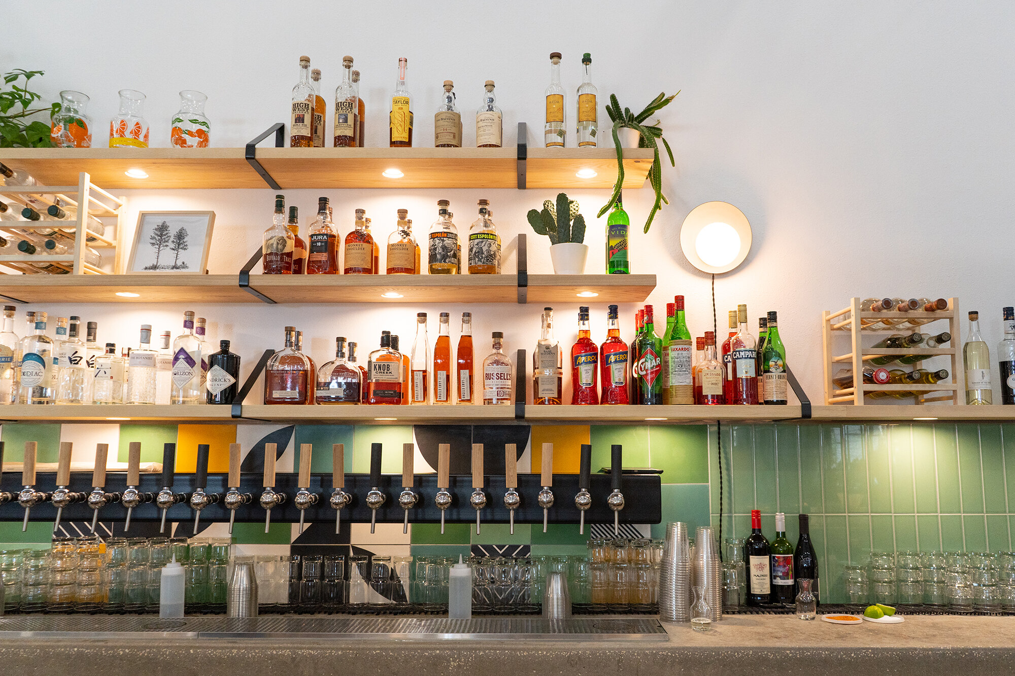
Next, it was time to shift our focus to The Joinery’s visual identity. One of the key points we needed to consider was that Jon and Sarah aimed to create a minimal, shareable space that could exist somewhat in the background and allow its vendors to shine in the spotlight. While the overall space needed to be beautiful and encourage guests to stay a while, we knew the primary reason people would frequent the space was for the food and drink. Because of this, we decided to create a black and white brand with an ultra-minimal approach. This would allow the food hall to not become overly busy, while also appealing to Sarah’s unique vision for Japanese Minimalism in the interior design.


Our approach led us to create a branding system that was flexible above all-else, with a variety of logo variations that could represent the food hall in all facets.


To complement the simplistic branding, we created a set of custom patterns that could capture the nostalgic spirit of vintage Florida and accent the florals that inspired Sarah’s interior design selections. We developed an orange blossom pattern that would later adorn The Joinery’s print collateral, as well a geometric floral pattern that was utilized on coasters for the bar, which happens to be managed by the Bucklew’s themselves.


The Joinery launched in January of 2020 with enormous support from the LKLD community. As the city takes on a cultural surge in the coming years, it will always have The Joinery to look to as one of the initial catalysts for positive change.