Slow Burn

1 Right 1
Slow Burn is built around the idea that great flavor is worth the wait. Inspired by the gradual build of heat, smoke, and spice, the project explores how thoughtful naming, bold branding, and cohesive packaging can create a memorable customer experience. From shelf-ready sauces to takeout packaging, every touchpoint was designed to evoke warmth, craveability, and the unmistakable energy of live-fire cooking.



Brand Naming
Brand Identity
Packaging

2 Center

Naming

Slow Burn captures the anticipation of flavor that builds over time. Inspired by the gradual rise of heat and spice, the name reflects the patience, craft, and satisfaction behind every bite. Memorable and playful, it sets the tone for a brand that embraces bold flavor and never rushes the experience.

3 Left
4 Center
5 Right

Branding

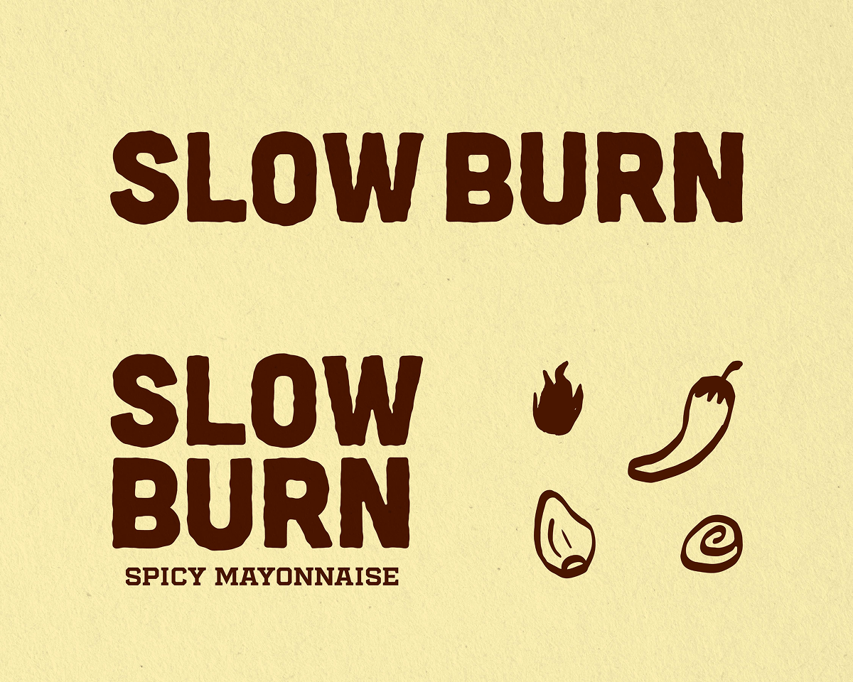
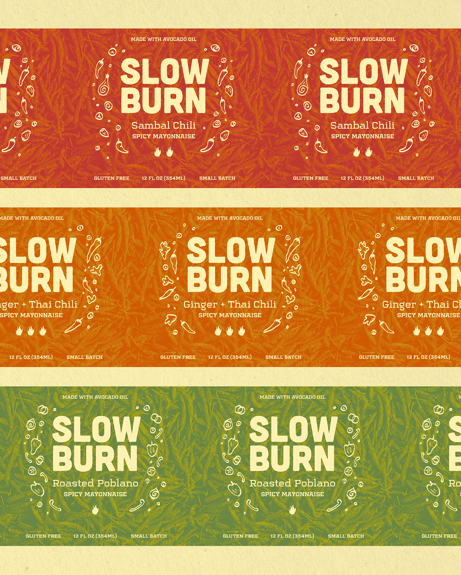
The visual identity was designed to feel as bold as the flavors themselves. A warm, fire-inspired color palette of rich reds, burnt oranges, and charred browns is paired with vibrant green accents to distinguish flavor profiles. Hand-drawn flame motifs and expressive typography create an energetic, approachable brand that feels equally at home in a fast-casual restaurant or on retail shelves.

6 Left
7 Right

Packaging

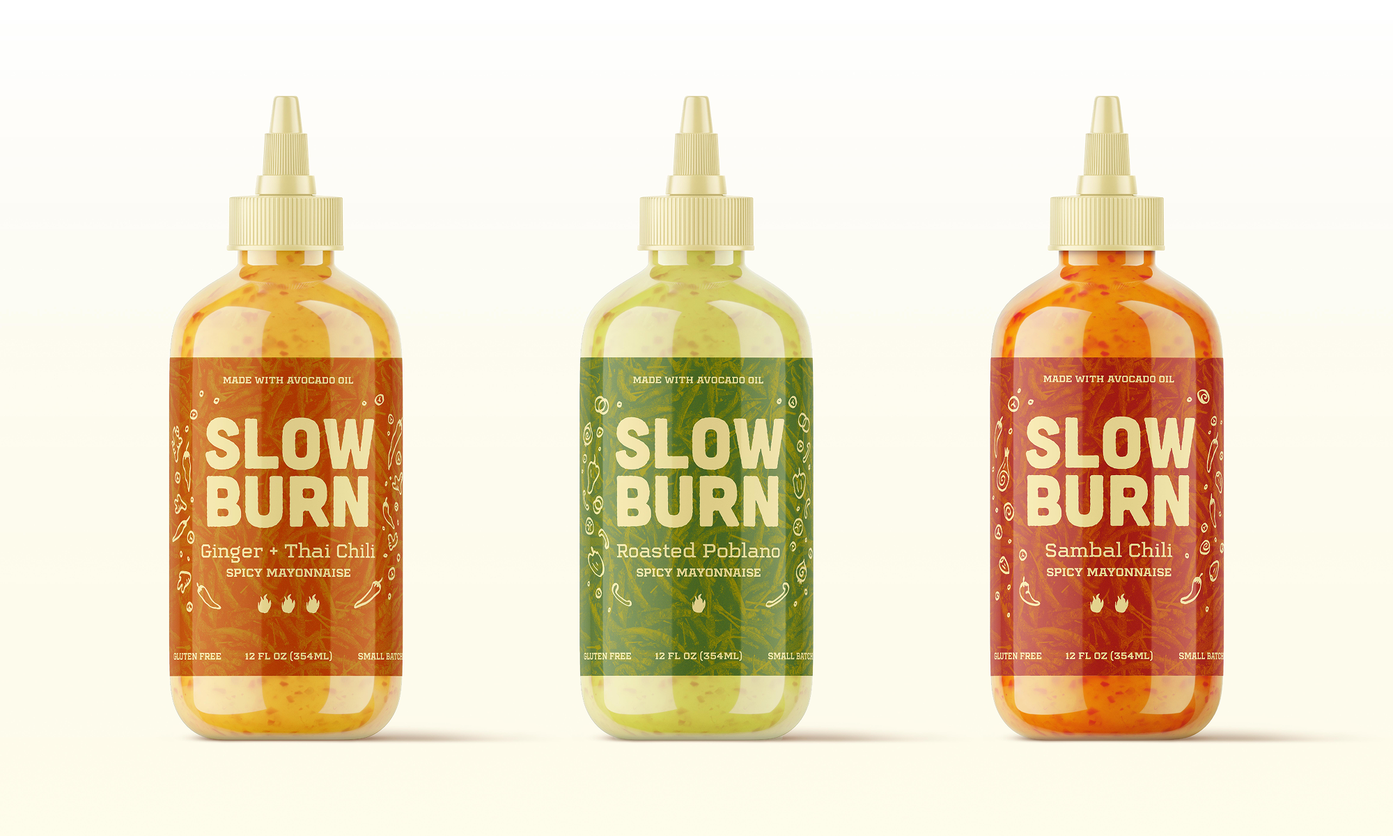
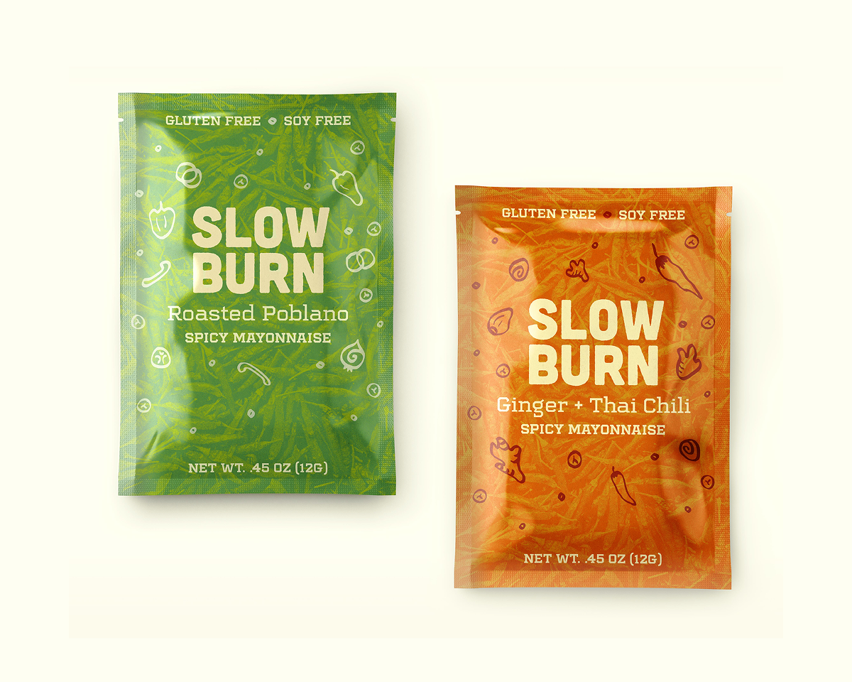
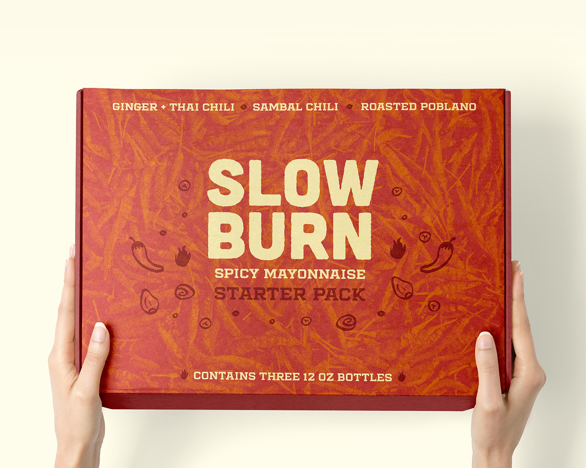
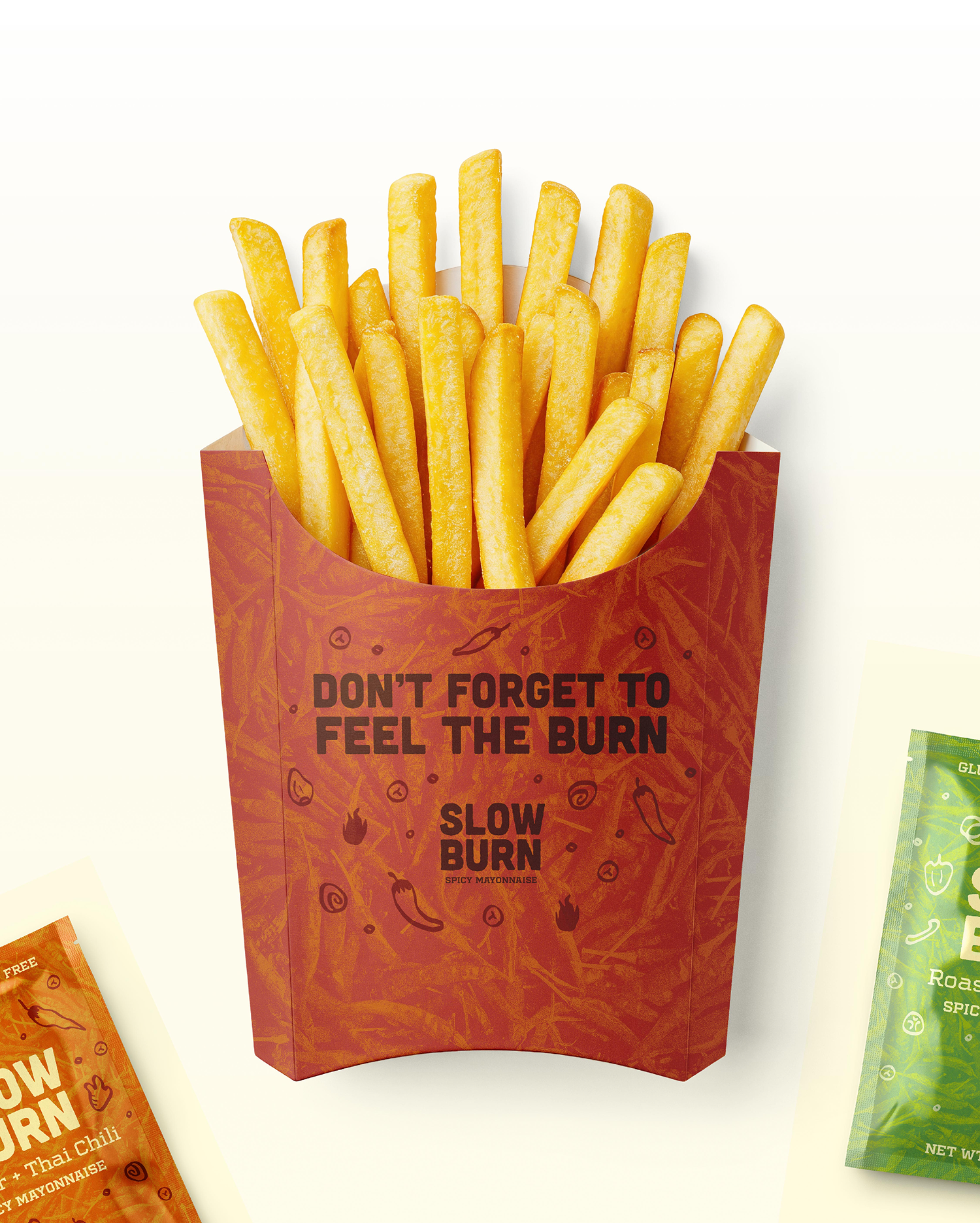
The packaging system extends the brand through a cohesive family of products, including sauces, seasoning packets, takeout packaging, and more. Strong color blocking and a consistent graphic language make each product instantly recognizable while allowing individual flavors to stand apart. Designed with both shelf impact and customer experience in mind, the system balances bold branding with clear hierarchy, creating packaging that’s as craveable as the food inside.

up next: